

To boost brand salience in their German market, Brabantia came to us with the task of running a social campaign focused on their waste category product: the NewIcon Pedal Bin. Exclusively advertised in Germany.
Our starting point for a concept, meant to built brand salience and overall brand awareness, came from a few insights. One. Compared to other brands Brabantia differentiates itself with a broad range of bins in different sizes and trend colors to match any room in anyone's interior. Two. German consumers have a sweet spot for good design and a desire to know all ins and outs of a product's unique selling points, before even considering investing in a product. Three. Brabantia of course focuses on their three main pillars to create products and to tell their brand story. Beauty: which means the product has to look good. Sustainability: either in their own manufacturing process, or in the products ability to let the consumer live more sustainably. Pleasure: using a product should be easy and pretty much self-explanatory.
With these different pieces of the puzzle now on the table we came up with a layered campaign in which we would make the beautifully designed bins stand out by placing them center stage in their own colorful settings. Accompanied by the most pleasurable and sustainable product USP's as text overlays to tell consumers all about what makes these bins a great product, and in turn, Brabantia a great brand for producing them.
This is one of the first campaigns to use Brabantia's new sonic branding. An upbeat and joyous musical composition using actual Brabantia product sounds as instrumental effects. The music in combination with some of the NewIcon Pedal Bin's main trend colors brought us the concept we coined 'Colorful Choreography'. The music would be a red thread for editing later on, giving us a foundation to build on by cutting to different angles, close-ups, movements and transitions between the different colors, sizes and text overlays on the music's beat. Now all that remained to get this show on the road, was to film everything. No biggie.
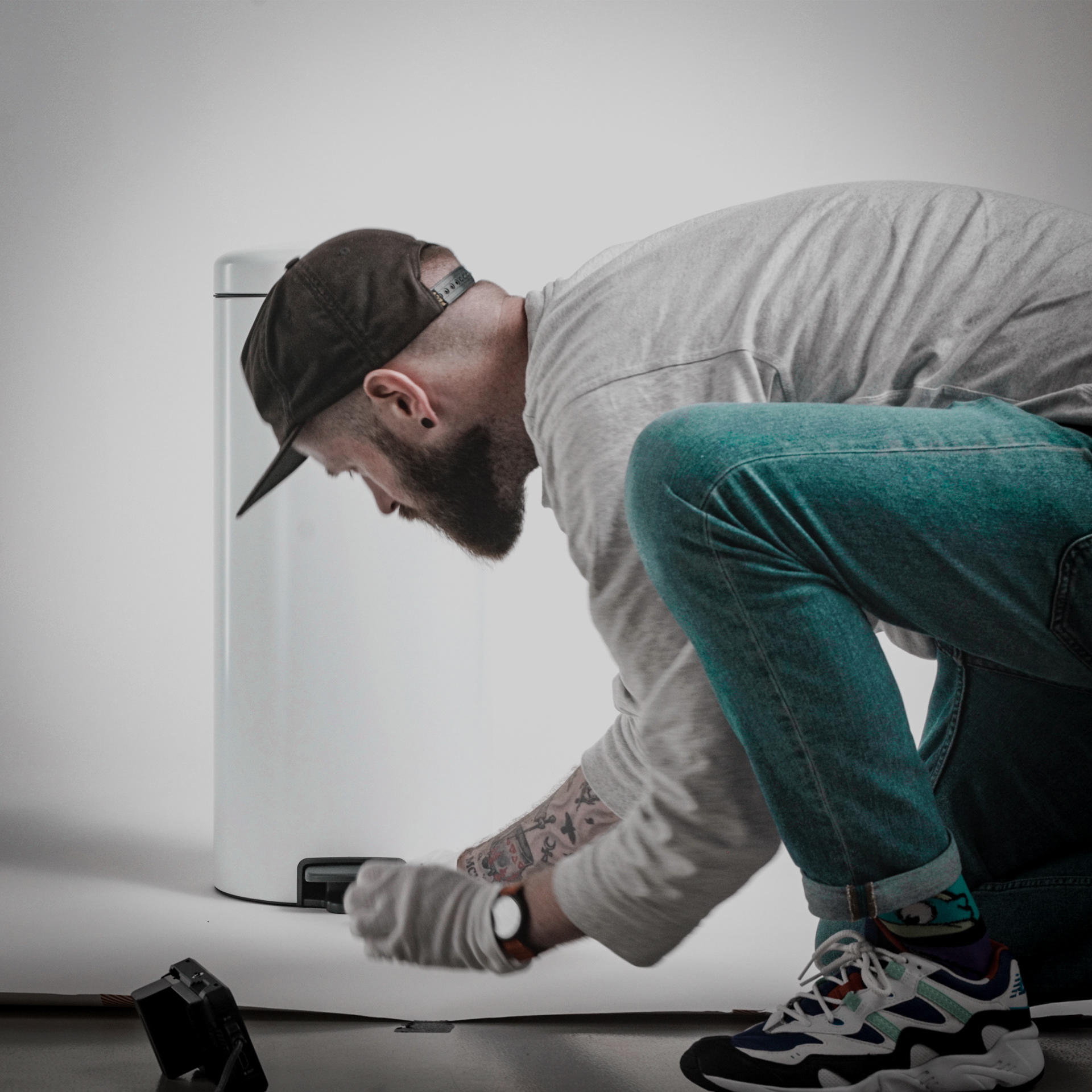
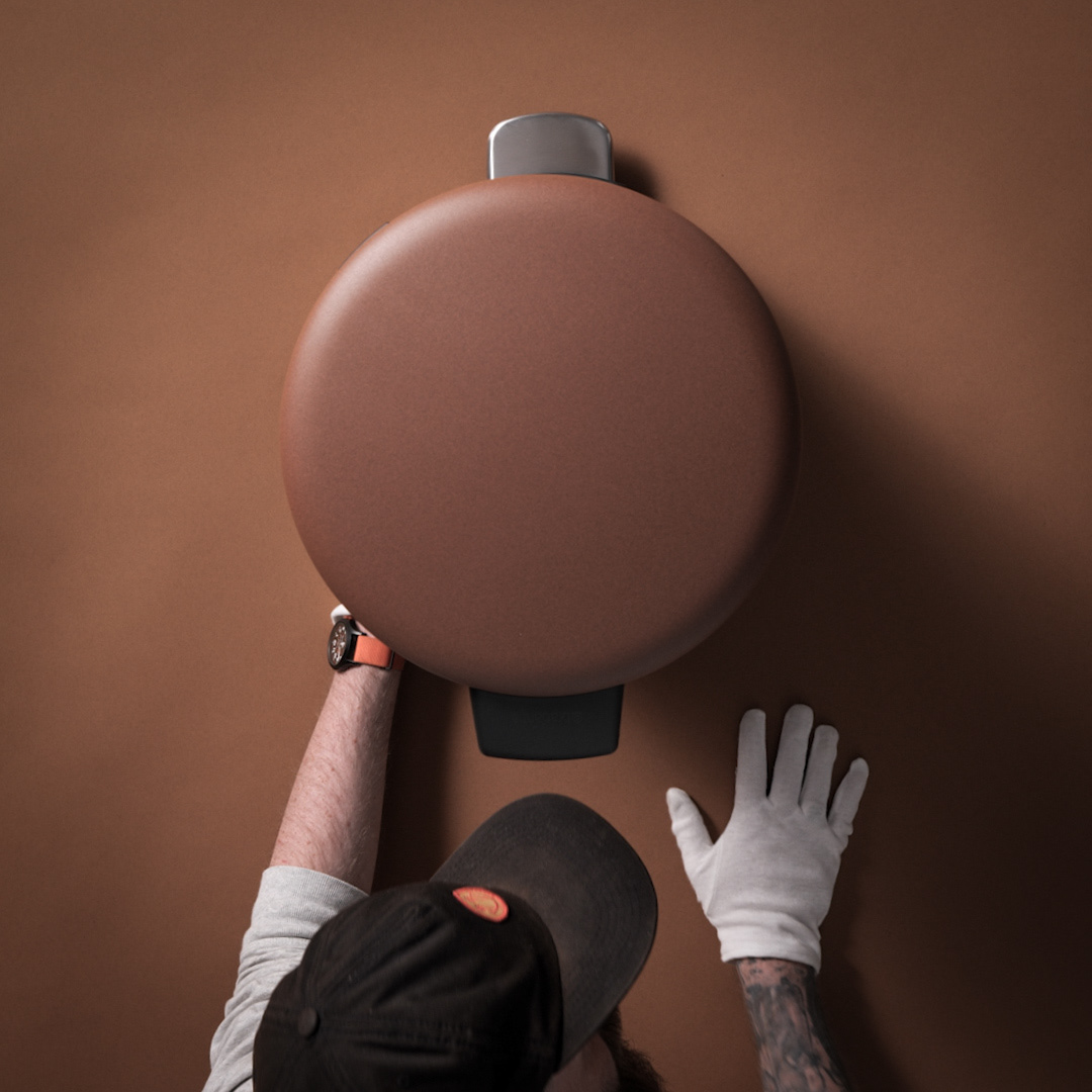
The challenge in filming was that we needed to align similar shots of the different colors and sizes of the actual physical products near to perfection, for an efficient post-production process. Inspired by stop motion animation techniques we came up with a ghost image set-up. Once you've set up a shot, you take a picture. This picture then becomes your reference image for every shot you take with the same camera angle. To make absolutely sure we had everything perfectly aligned before even thinking about pressing record we did this with not one, but two ghost images. One from the front, and one from above.
This of course takes time and perfection to get right. We set up the shot, created our ghost image and recorded our first take, swapped out a different color roll of background paper and the product, and aligned it to the ghost image reference. Rinse and repeat until you have a ton of shots to mix and match, and presto. Result. Reward.
This of course takes time and perfection to get right. We set up the shot, created our ghost image and recorded our first take, swapped out a different color roll of background paper and the product, and aligned it to the ghost image reference. Rinse and repeat until you have a ton of shots to mix and match, and presto. Result. Reward.
With everything recorded and set for post-production the campaign side of things gave me a list of multiple deliverables with different aspect ratios and durations for different media channels I needed to create. However, by applying the same rules in audio, grading, typography and branding all these different video's come together well to tell consumers what this bin and the brand is all about. Who says waste can't be beautiful?
Client
Brabantia
Creative Skills
Concept, Video Editing, Animation, Art Direction
Software Skills
Adobe Photoshop, Adobe After Effects, Adobe Premiere
Team
Robin Raynor
Luuk de Graaf
Renske van den Bogaard
Elaine Leijssen
Rick Proosten
Jajke Mertens
Rik Vaessen
Brabantia
Creative Skills
Concept, Video Editing, Animation, Art Direction
Software Skills
Adobe Photoshop, Adobe After Effects, Adobe Premiere
Team
Robin Raynor
Luuk de Graaf
Renske van den Bogaard
Elaine Leijssen
Rick Proosten
Jajke Mertens
Rik Vaessen